Katie Hodges Portfolio

Mini Ad Campaign

The Team

  • Motion Designer - Gavin Brown
  • Graphic Designer - Katie Hodges

Deliverables

  • Three printed ads
  • One video commercial ad

The Brief

3 billboard Health Canada Ads

We were challenged to come up with a compelling awareness campaign for Health Canada showing the dangers of teenage marijuana use.

The campaign contains 3 printed ads for magazine or poster use, as well as a 30 sec commercial and they must be easily recognizable as being from the same campaign when viewed alone or together.

The Goal

We wanted to make an impactful campaign that will draw attention to the damage that can be caused when teenagers start smoking marijuana regularly before the brain is fully developed.

Because this project was print ads, as well as a commercial, they needed to be cohesive and identifiable as a pieces of the same campaign.

The Challenge

It's one thing to make a marijuana awareness campaign, but it's another thing to do it in a country that has legalized marijuana. The campaign had to point out the long-term damage that can be caused when comsuming drugs without being pushy.

When I came up with the design idea of using a glitched effect to play with your eyes and give a slightly uneasy feeling, I wasn't 100% sure how to create this effect in photoshop and after effects, but I knew it would give the feeling we wanted.

Research

My main goal with the research was to see what previous awareness campaigns and what worked in them and what didn’t, since we would be doing this in a legalized environment. Most campaigns had a direct message of “Don’t do drugs”, but I felt this wasn’t the most effective way to promote awareness when people of age are able to consume marijuana. I used the Health Canada site to look at the stats of teenage drug use and was incredibly surprised to see that most teens have tried drugs in some form during high-school.

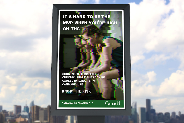
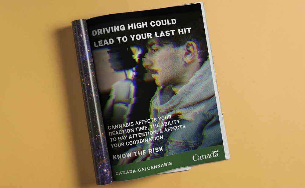
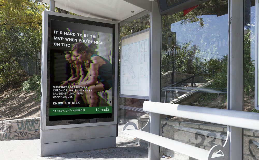
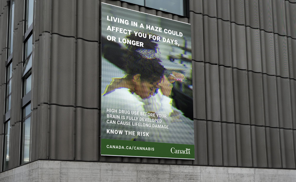
I decided to go the route of giving actual information and why drug use as teenagers could be damaging in the long term, but more playful than just facts. I really wanted the message to come across as catchy, but with an underlining tone of health and awareness. Many of the articles I read during my research showed that teenagers don't respond as well to ads or PSA's that promote abstinence only solutions. The taglines are meant to be informational and not direct rules teens should follow. Providing teenagers with facts and knowledge is a more effective way to help them make better decisions on drug use and abuse.

Final Results

We had 3 main goals with our campaign:

  • Keep it consistent
  • Provide factual information
  • Keep away from the "Don't do drugs!" campaigns

To keep things consistent we were able to source royalty free video and photography of the same group of actors/models. To add style to this we created a glitch effect for both print and commercial ads, that gives your eyes an almost "looked at a 3d poster too long" feeling.

The taglines throughout the campaign are based on information provided on the Health Canada website, which keeps consistence across campaign and web in case someone wants to do their own research.

By creating an overall uneasy mood with our campaign we created a snippet of what overconsumption can feel like. I believe we met our goal of combining facts and feelings into a teenage marijuana campaign, without coming across as pushing or anti-marijuana. Mis-information is everywhere on the internet and we want teenagers to be informed before making their own decisions.

LRG Website Layout
LRG Website Layout
LRG Website Layout
LRG Website Layout