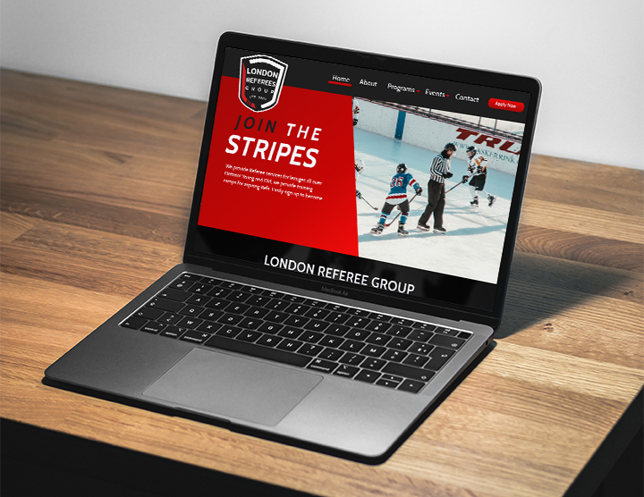
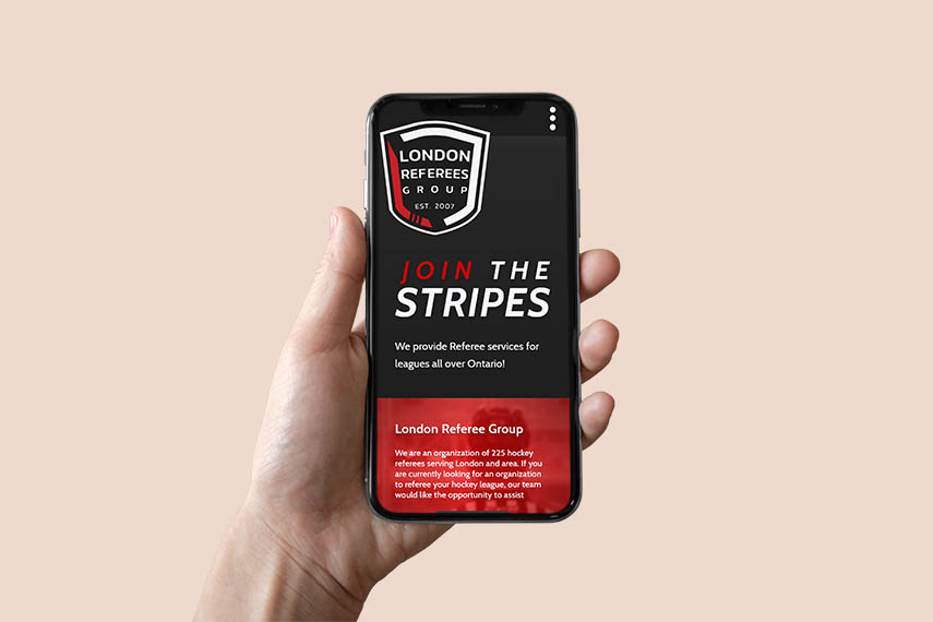
The London Referees Group was established in 2007 to coordinate the training and scheduling for hockey games for leagues in the London and surrounding area. The organization consist of 225 hockey referees that work together to be the invisible third team on the ice, keeping things safe and fair for both teams.
Continuous training is a staple for London Referees Group members, with an extra focus on their Junior Mentorship program that teaches the younger referees how to call the game fairly in a professional manner.
Although at the time of creating this project we are dealing with an interesting time in our
lives,
we felt this project could provide some hope for the future. One day we will be back on the ice
and
London Referees Group is going to be ready for the puck to drop.
Our goal was to give their whole brand a major glow up in a way that will make London Referees
Group
stand out among the other organizations in the region.
With the previous site that was in use, the content was minimal, and imagery was nil. There was
no
logo on the site and no branding what-so-ever. The client felt it would be best to create
everything, including a new logo, since he felt the current one wouldn’t suit any new and
updated
brand.
Our challenge was figuring out how we could create something out of nothing and make it clean
and
easy to navigate. After our first round of feedback, we were notified that the organization
would
like to use the colours black, grey, white and red, which was in complete contrast to what we
created. With this in mind I would have to come up with branding colours, layout and imagery
that
would help them stand out when compared to the other regional referee group sites, which are all
similar colour themes.
Since the original pitch did not include branding information and the previous website contained little information, I checked out the websites for the referee organizations in the Southwestern Ontario region to get a feeling for the layout of our design. I discovered that design is not always the first concern for many organizations currently, and the content didn’t always flow well. I also used Pinterest to search for graphic and site layout inspiration.
The final design was focused on being clean and simple to navigate. Off black and white were used with a red gradient across the site with a strong angle dividing the content into easily digestible sections. The typography used was Cabin in varying weights, so that the content and imagery was the main focus. The hero image on the landing page had a simple parallax effect to give the site more visual engagement and cut out referee images slide in from the side of the page as users scroll down.
Our design campaign was selected by London Referees Group as the winning design. Over the summer of 2021 our team worked together with the London Referees Group board and made this website and logo happen for them. The final design created to fit the LRG requests can now be seen at londonrefereesgroup.com